Brand Your Website – Flame Lily Sound Therapy
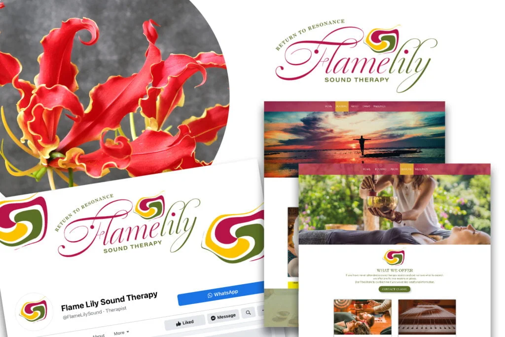
I was delighted when Claire approached me with a view to branding her new Sound Therapy Business. I took inspiration from the colours of the Flame Lily flower, native to Claire’s home in Zimbabwe.
I was delighted when Claire approached me with a view to branding her new Sound Therapy Business. I took inspiration from the colours of the Flame Lily flower, native to Claire’s home in Zimbabwe.
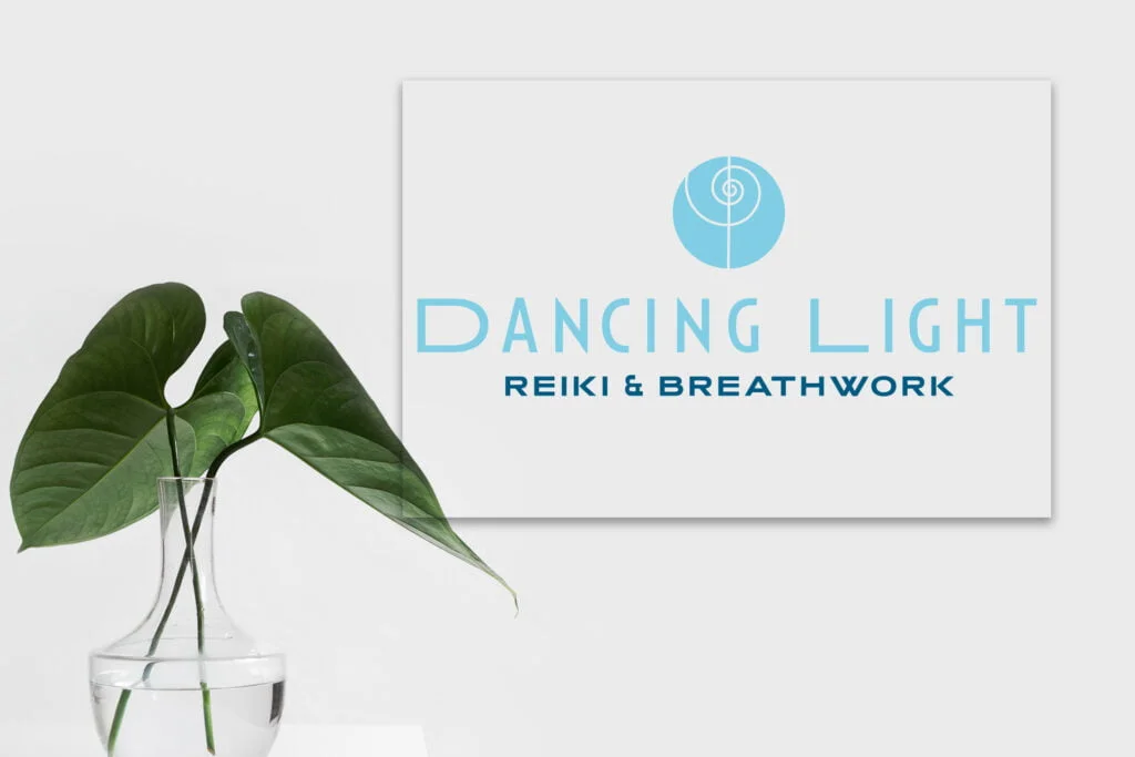
Glyn from Danking Light Reiki and Breathwork approached me to design her branding. Utilising the Reiki “Power” symbol and clever use of typeface and colours resulted in branding that the client loved.

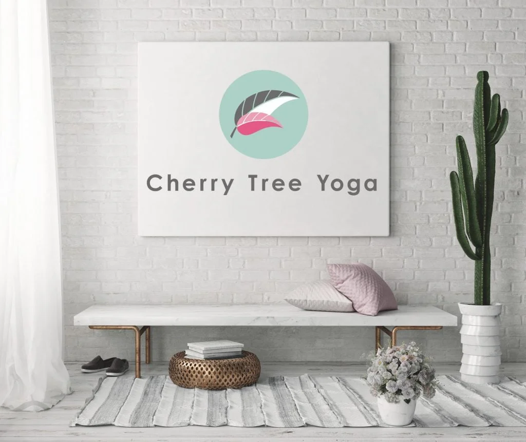
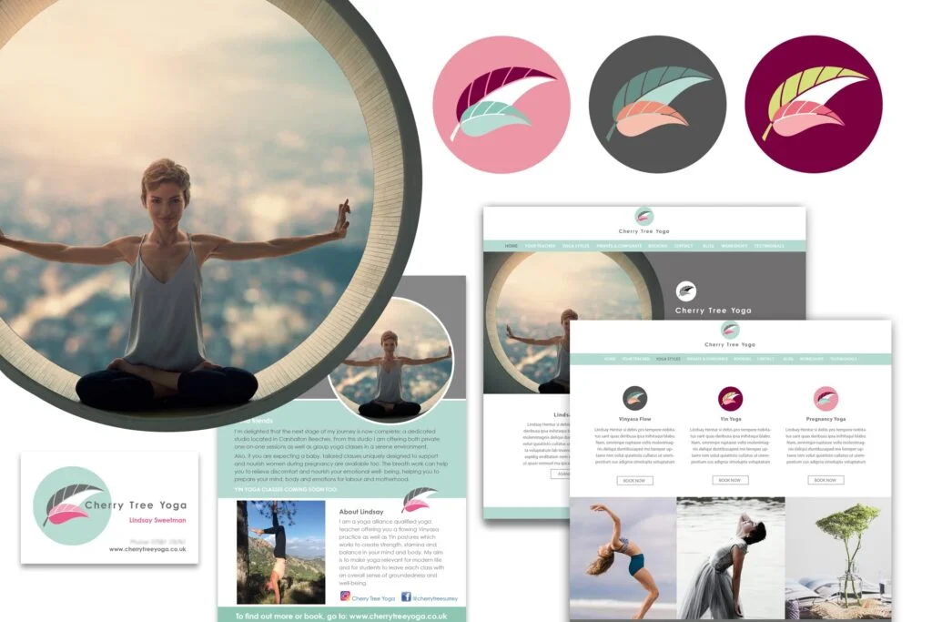
I knew Lindsay through classes that we attended together and was aware of her desire to complete her teacher training and set up her own studio. So I was delighted when she approached me to create her brand.

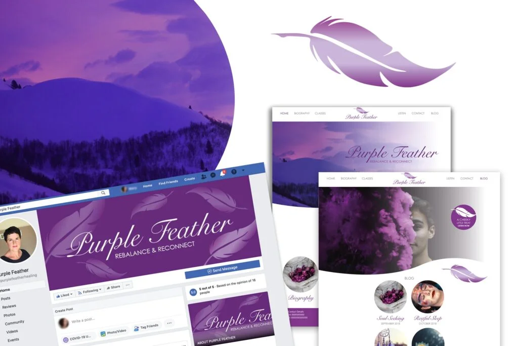
Having helped her to name her business and created the Purple Feather Logo Design for her new venture, Susan wanted to ensure that her website really reflected her brand.

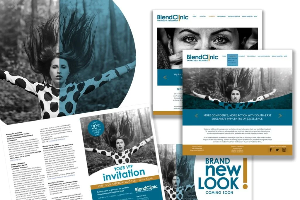
Blend Clinic offers a highly specialist treatment and is unique in its field. Their client base is both male & female so it was important to develop a brand that appealed to both sexes.

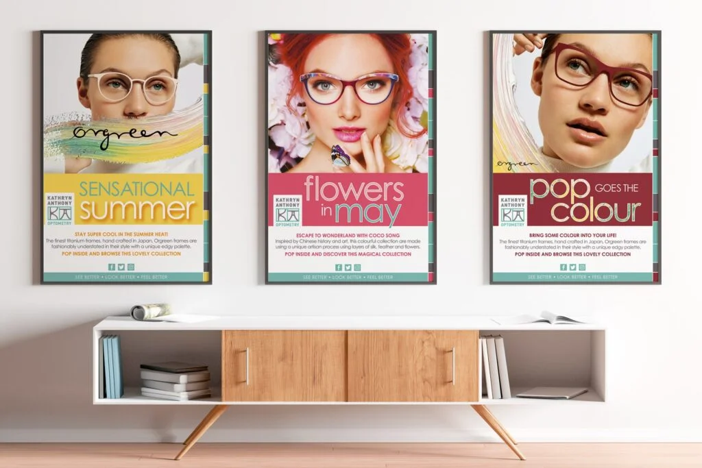
Kathryn’s core palette is the fresh teal tone, cool grey and white key lines. She didn’t want a new logo design but did want to build on that to raise her profile.

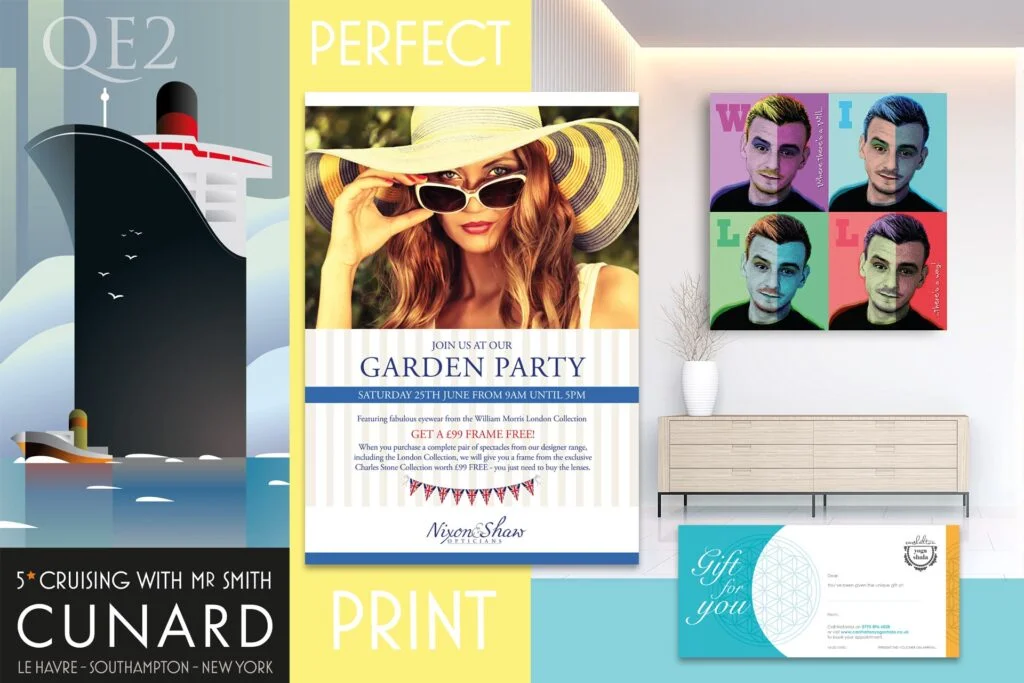
Occasionally, I am lucky enough to be commissioned to produce artwork solely as a creative print project as well as promotional flyers for smaller business and large format exhibition artwork.

The story behind this brand was so personal that I particularly wanted to do it justice. It’s a feminine look, yes but the brief was ‘not too girly’ so I think the end result has the right balance.

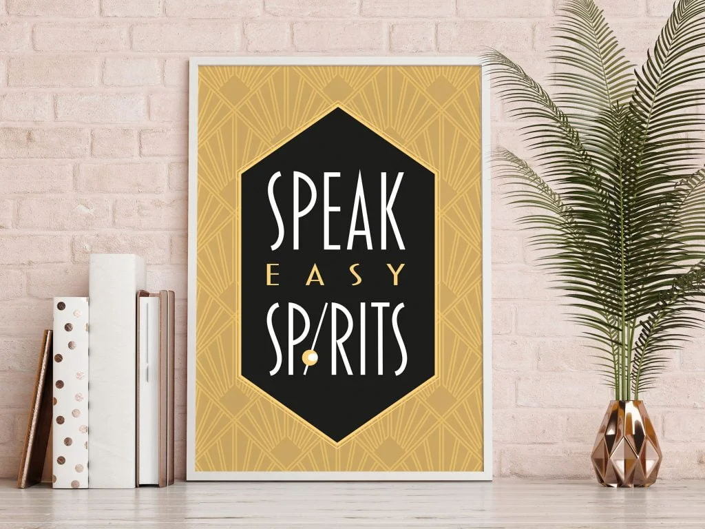
The distillery had already chosen the name of the new Craft Gin, but wanted an identity that reflected the ‘tongue in cheek’ prohibition reference.

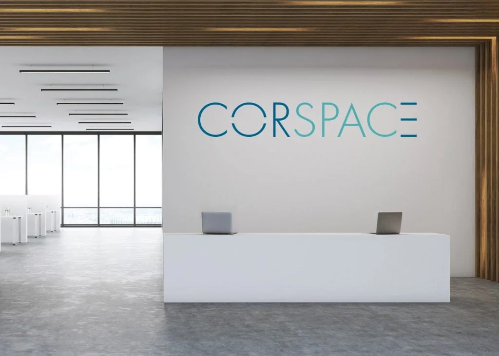
For Corspace, the brief was to provide a logo and branding that was modern, professional, credible and aspirational. The client was looking
for an open and welcome tone of voice that demonstrated possibility, opportunity, encouragement, innovation & quality.